Basics of Graphic Design - Part 1: Elements - Line and Shape
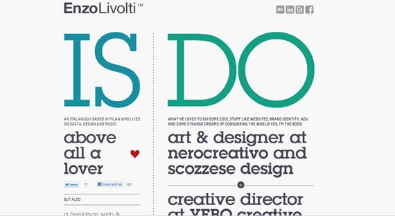
The font is usually present in every design, even if it has a 1-pixel or 5-pixel dotted border. All web sites contain lines, but with minimalist simplification
(Also known as simplification or minimization)
Which has become common in recent years, there is an attempt to scan lines from page layouts, or at least reduce their use.
Lines can be long, red, straight, slender, blue, sporadic, short, black, or curved, but all fall under the same category. Fonts are often used to draw boundaries between design sections, or to direct the viewer's attention to a particular destination.
The lines create different visual effects and occurrences. Thick, wide lines attract attention because of their optical power, while thin lines have a different effect opposite. Colors also have an effect. Dark colors are easier to see and attract attention than light or dim colors.
That's not all. Font mode can also affect how the user sees it. This style can be easily defined through CSS, and can be, among other styles, stylized, dotted, and sporadic. Solid lines have a different effect from the effect of dotted lines, because the former are more prominent.
In the simplification method of the minimum that we talked about earlier, either the less rigid lines are used or the curved lines are used more because they give a dynamic and streamlined appearance of the design, which is also a goal of this method. These lines suggest energy, keep the user interested, and if combined with illustrations will have an effective power in front of the human eye.
The solid lines were very popular many years ago because they defined design style; solid, coherent, and orderly. But Web sites have changed in recent years and this style is no longer popular, especially in the designers' Portfolio and other pages with a great need for personal touch.

Form, or body, is the second most used element in web design. It is actually a combination of lines along different forms. Forms are still popular, and this is because of the need to highlight something, and shapes are one way to do it. The shapes may be circles, squares, rectangles, triangles, or other abstract shapes, and most designs contain at least one of these. Many of these shapes are used in minimalist simplistic designs, as they are mostly based on illustrations and schemas. The old style of web design also ensures shapes, so they remain popular all the time and are likely to continue in this way.
Shapes, like lines, are connected to the human mind in different ways. For example, circles are connected to motion and nature, while squares are viewed as structural structural designs. As in lines, a color, pattern, background or texture can completely change the perception of the viewer
happy halloween you all and Hello halloween party t shirt
halloween t - shirt happy halloween t shirts Halloween Funn
music t shirt / plays music with us
happy birthday t shirt
No comments:
Post a Comment